
I’ve been playing video games since the 90s, but after a long hiatus and only getting back into it a short while ago, I’ve jumped back into older games while also enjoying new ones. One of those goals was to try out some popular game franchises I see spoken about daily but never got a chance to play myself. While I finished some and jumped to others, one aspect came up quite often when it came to immersion and fun: the mini-map.
It’s not just the actual inclusion of those small maps on your game’s UI that makes a difference but also the colors, details, and of course, the location used. In many modern games, you can turn off all of the icons and images on the UI to enhance the immersive experience. There are even settings where you can change the colour schemes to help those with colour blindness, but there are often none to move the icons, like the mini-map, to make it easier for those with specific visual impairments.

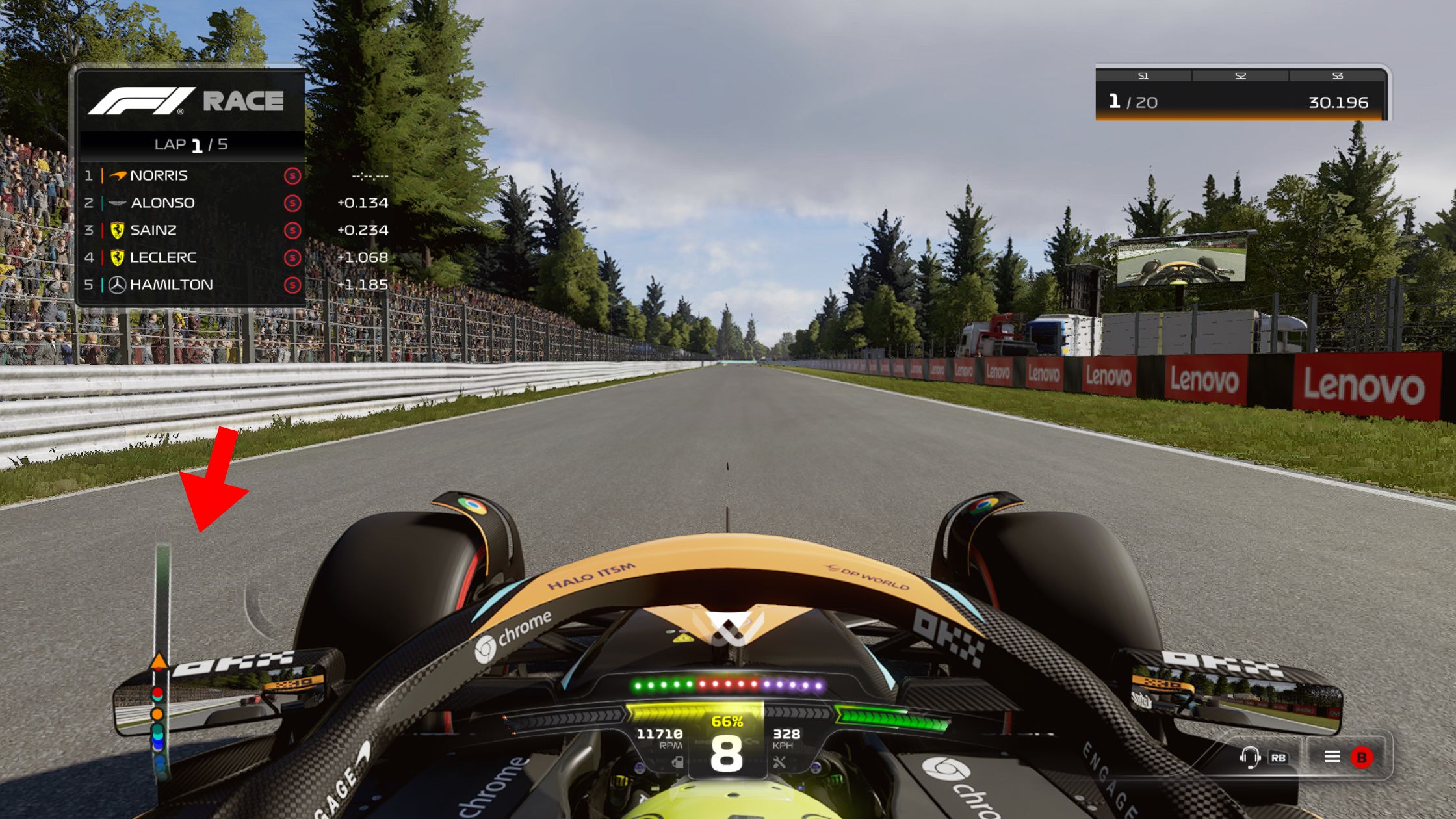
In my situation, my visual impairment leaves me with mostly peripheral vision in my left eye, making it difficult to see certain things on the right side of a screen. I specifically noticed mini-map locations when I dove into The Witcher 3: Wild Hunt where the mini-map is in the top-right corner, making it very hard to follow certain paths. I went back to games that I’ve played, many of them action, action-RPG, or racing categories where I noticed that most of the maps in my experience had the mini-map in the bottom-left corner. There are genre-specific variations of these maps but more often than not, it’s an abstracted view from the bird’s eye perspective.
There are always exceptions to the rule, but what makes a difference about these maps, especially when you’re visually impaired?
Map Location
For many gamers, the location of the mini-map isn’t noticed because it’s either not used, you’re used to the franchise’s UI, or you turn it off and only want the beautiful visuals on screen to explore without any assistance. However, for many like myself with a visual impairment, finding our way is a bit trickier and the location of the map starts making a difference.
For games like first-person shooters, racing games, action-RPGs, and even strategy games, the mini-map is usually on the left side, especially at the bottom. MMORPGs almost always place theirs in the top-right corner.
Usually, this placement is due to the perspective as it often means this is “behind” the character or in an area of the map where we rarely need to focus on any sort of gameplay. This means that the bottom left corner is perfect because it’s not going to interfere with the action going on in front of you, and you have to draw your attention away just slightly. In Western cultures, we usually read from left to right, which also affects where we look first and then follow to the right. However, just looking to the top-right corner to “check” the map, draws your attention there first which can prolong your reaction times.
All of the detail, or none of it?
The mini-map is usually a smaller version of a larger map that the game already has but we don’t always want to see all of the same details. RTS (real-time strategy) games often have quite a large area section shown as one controls a larger area of the game with units, terrain, and buildings being seen from above. Shooters and racing games will provide you with a much closer view, only showing you your direct vicinity to find out where your character is and maybe which direction you’re going or need to go.
How much detail a mini-map has can make a big difference for those with visual impairments. Certain colour combinations will be better for those with colour blindness and just having too much colorful detail can end up distracting from the real action being displayed on the screen. Mini-maps often have a basic colour scheme to ensure that when there is a contrasting colour for a point of interest or highlighted path, it’s noticed easily. We also want those compass directions on there too, or at least an icon for North, to help with navigation.
To streamline the UI, many games declutter the map by using the often circular mini-map with status bars and other finer details you want to keep note of. However, it can again become quite distracting if done wrong. Too many bars or details will widen the small map and it can bleed into the action happening on the screen. I’ve experienced some mini-maps that use either side of the map for their bar, helping with the diameter.
Full-sized maps usually have recognizable icons for buildings, vehicles, and other points of interest that reflect what they would look like in the real world. They often have the names of these locations too, but should the same happen on the mini-map? These metaphor images are usually enough for the maps without too much extra text making it harder to see the important details.
Immersion with a visual impairment
One might think that adding more information in the UI like a mini-map, status bars and more icons would help somebody with a visual impairment, but it could completely distract from the gameplay. Games can be like big movie set-pieces, so we want that cinematic feeling when we dive into their worlds.
With some visual impairments, it’s not possible to see a lot of detail, so having less on the screen, maybe to a point of no UI at all, might help the gamer find their way and play the game more effectively. When there’s less to look at, the focus can be on the natural environmental clues instead of looking away at colourful maps and numbers across the screen. One of my favourite examples being Dead Space which uses the character’s suit to show Isaac’s health instead of a UI status bar.
“Depending on the game, no mini-map – or even no UI entirely – can really give the game a cinematic feel” – Kervyn Cloete
Being able to partially or completely reduce UI elements may help gamers with visual impairments feel more immersed in the world. For some, audio clues could help but even those can/should be optional.
Do we still want the mini map?
A mini-map is supposed to work as a quick reference for finding yourself or teammates while things are happening or just finding your way to a location you’ve set a waypoint for. These details help to give you a smooth experience to help immerse yourself in the meticulously-created worlds of these incredible games. It can help those with some impairments explore more effectively while still being immersed in the world.
You might not always notice how you experience the inclusion of a mini-map, but when it suddenly changes, it can have a larger impact on those you rarely think about. Whether it be the location, icons, or other details added to the map, details matter, even if it’s less detail than necessary.

One thought on “The mini map is important to those with visual impairments”